Team: Myself and two other designers, the founder, and a team of 3 engineers
Duration: Two years, five months
My Role: Research, Design, QA Testing, Product Management
Tools: Adobe Illustrator, Trello, Screen Hero
Modify ink is a unique, web-based art editor that enables anyone to customize art on their site. Simply select art you like, then change each element’s colors, patterns, and textures to fit your style, decor, and personality.
OUR USER
Some people can go to an online site like Minted.com, purchase an art print, hang it on their wall and be perfectly happy. Our users are different.
• They want something specific for their spaces - maybe they have a color scheme they are going with or have a specific style they are trying to maintain
• They appreciate that Modify Ink allows them to alter the art they pick to fit their needs perfectly
• They enjoy curating the look of their home and feel proud of the spaces they create
• They are computer savvy enough to be comfortable in our editor and are not afraid to shop online
Modify Ink's editor allows the user to customize the art they select to perfectly match their space
ONE TEAM, TWO COMPANIES
It all started with the idea that had been brewing in the back of founder Rachel Brenchley’s mind for a couple of years. She wanted to create an e-commerce site that would allow people to customize artwork by changing colors and patterns.
She owned a scrapbooking company called BasicGrey, which had a massive library of art, patterns, and textures that she could utilize for the new business. She also had an existing graphic design team to help her make her vision a reality.
The plan was to leverage assets from BasicGrey into building this new company.
Since we were essentially piggy-backing one company to start another, time, resources, and employees were in short supply. Our roles and responsibilities as an employee of BasicGrey did not change. Now, we also had a full set of duties with Modify Ink.
We had to divide our time between both companies. Also, all profits from BasicGrey were funding the new venture. Time was of the essence. The sooner Modify Ink could launch and start making money, the better.
THE TEAM
Since we were a lean team with a full existing workload, we shared our time and talents. We all provided valuable input on the design and collaborated on every step of the development process:
• Naming the company
• Deciding the features and flow of the entire site
• Creating the look and feel of the visual design
• Iterating on the user flow
• Determining the tone and voice of the copywriting
• Designing the experience customers have when receiving their order
MY ROLE
My role in Modify Ink was Product Development Manager. In addition to brainstorming and researching, I oversaw each step of the process. I was in charge of best practices and procedures, developing, revisiting, and refining the site, and managing the design team.
I was the project manager. I facilitated the schedule and directed the process and priorities. I worked closely with the founder to ensure we stayed on track and everything was moving in the right direction.
After we hired a team of three engineers who worked off-site, I was the primary contact for them. I communicated with them throughout the day via Slack, Trello, and Screen Hero. I tested the site daily, looking for any bugs or problems with flow and function, and would communicate them with the dev team.
We had bi-weekly in-person meetings that included me, the dev team, and the founder. We would go over the progress and current projects in these meetings and discuss new features and upcoming projects.
OUR PROCESS
We had to start from square one. We didn’t have a name, a vision, a game-plan... We only had Rachel’s idea. A series of retreats followed where we brainstormed, debated, sketched, and pretty much ate, breathed, and slept with our ideas flowing. And there were so many ideas...
RESEARCH
I started by researching the market to see how consumers currently purchase art online. How did sites like Minted, Spoonflower, Society 6, and Etsy flow? How did the buying process look? What aspects of their site did we like, and what factors would we improve.
We had the unique value of customization that these other sites couldn’t offer, but what parts of the user experience did we want to incorporate? Minted and Society 6 put a significant focus on the designer of the artwork. We wanted a large pool of contributing artists on our site, each with their gallery of artwork available. We liked how Etsy had specialized dashboards for the shop owners and users to view their orders, save favorites, connect, and have a personal profile. As a team, we brainstormed how to incorporate the competitors’ different elements into our user experience.
WHAT IS AN MVP?
We struggled with an over-abundance of ideas and too broad of a scope. We wanted to incorporate so many ideas and layers of complexity that we became overwhelmed with all the directions we could go.
It wasn’t until we hired a technical co-founder that we had someone explain to us that we needed to start with our product’s core and expand from there.
He was hired to develop the technology behind the idea. Before anything else, we needed to know if our concept was even possible to build. From there, we could work on the rest of the site.
FOCUS ON OUR BIGGEST ASSET -
OUR UNIQUE, IN-BROWSER ART EDITOR
OUR UNIQUE, IN-BROWSER ART EDITOR
It was essential to stop the waterfall of ideas and focus on the core product - the art editor. Our editor was a new technology that did not exist. Hiring a technical co-founder was the first step. He built a bare-bones version of the editor that had the basic concepts down. This prototype allowed us to begin user testing and see if the process was functional and made sense to others.
For research, we relied on friends, family, and coworkers to test the product with us. We learned valuable insights that we incorporated into the designs:
• We need a way to organize the palette options because there are so many colors and styles and different coordinating patterns that it was overwhelming
• We needed tools to manipulate the fills to fit each design better - scale, rotate, flip, etc.
• Too many options - We needed a way to filter and find specific colors or patterns without having to see everything at once
After testing this design iteration, it was apparent there were too many pattern options. It made more sense to start with a basic palette and allow the user to add additional palettes if they wanted more options.
A CUSTOM PROFILE PAGE FOR THE USERS
After spending so much time customizing their art in the editor, there needed to be a way for people to save their creations to reference, edit, or purchase later.
We had to create a unique user profile. This profile would be custom for each person and allow them to showcase their creations.
We also needed to display contributing artists’ art on their profile and the different variations they created.
To feel like a community, users could view an artist’s profile, select artwork or variations of that particular artist, and learn more about them.
WHAT IF THE USER WANTED TO PURCHASE THE ART AS-IS?
The detail screen was a step between the gallery and the art editor to give the user the option of selecting an existing color variation of the artwork they like. They could view the different versions other users created and start from any number of possibilities.
We also incorporated some social aspects to the site by allowing people to favorite a design, comment on the artwork, or see other art from the same artist.
BETA LAUNCH
Once we had the site functioning how we wanted, we did a soft beta launch to start testing it. We did our usability testing by demoing our product at various trade shows that would draw our target audience - Pinners Conference, What a Woman Wants Expo, Bash Conference, Build Your Blog Conference, SNAP Conference, etc.
Demoing at these Conferences allowed us to see the product in the users' hands and get valuable feedback. The response was overwhelmingly positive, but the function of the site wasn't as intuitive to others as we had hoped.
CHALLENGES
HOW DO WE COMMUNICATE OUR VALUE PROPOSITION TO THE CONSUMER?
Our web-based art editor was unlike anything else in the market. We needed to educate the user on an entirely new concept.
When we questioned users about their experience, we learned that it wasn’t clear that you could edit the art. They saw a gallery of art, but then what? We decided to add a little instruction on the top of the gallery page.
The instructions appear at the top of the gallery for first-time users and go away once the user has accessed the editor
HOW DOES THE EDITOR WORK?
Once the user entered the editor, they did not know where to begin or how to use it. We added a tutorial to walk people through the process.
MAJOR PIVOT
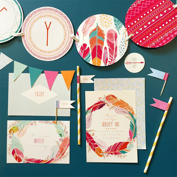
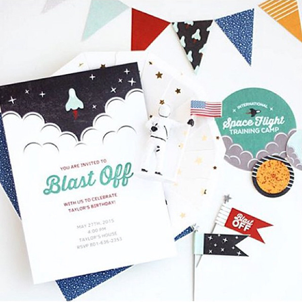
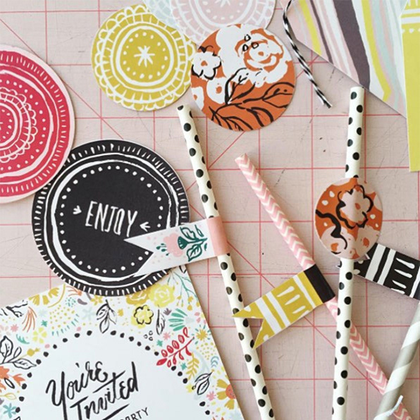
PARTY DOWNLOADS
While slowly gaining traction and getting its name out there, Modify Ink was not generating enough sales. The creation of this product was bleeding the parent company dry, and we needed to make money. We decided to add digital downloads to the site and created a new product offering - party downloads.
This pivot essentially required us to reinvent our product. It was a huge undertaking and I have a separate case study on that process.


Party downloads offered a new product in addition to art prints
THE END WAS NEAR
Party downloads could not save the company. Too much money was already invested and the customer base was not there to bring in more revenue.
Within a few weeks of launching party downloads, I left Modify Ink. At that time, there were over 400 customizable templates and more than 1,200 patterns.
Unfortunately, a short time later, both BasicGrey and Modify Ink went out of business. BasicGrey couldn’t bear the strain of funding a startup during a downturn in the scrapbooking industry, and Modify Ink couldn’t generate the traction it needed to succeed.
Rachel eventually sold the technology to a software-as-a-service company.
CHALLENGES
WHY DID MODIFY INK FAIL?
Our response was excellent - people couldn’t believe what a good idea it was, and after a quick tutorial, they found it was easy to use. However… it never turned into sales. User analytics showed people spending hours on our site and coming back more than once. However, this did not translate to them ordering prints. Why? I don’t believe that question was ever truly answered, but I have some ideas.
I BELIEVE OUR BIGGEST MISSTEP WAS A LACK OF RESEARCH
We assumed because WE would want this product that others would too. The problem is, we were a group of graphic designers who were comfortable with our design abilities. We used high-tech programs in our day-to-day life and were online shoppers.
The people who tested our product were similar to us. They were blog writers and tech junkies. They went to conferences and were trendsetters, influencers, and many forms of a designer.
We had too narrow of a niche. Industry competitors were companies where people didn’t have to trust their own abilities or use technology to create a product. Consumers simply went online to Minted or Etsy, found a piece of art they liked and ordered it. Easy.
Our product could very possibly be intimidating to the majority of people. If we had done more in-depth research that reached a broader audience, we might have gotten a better perspective on the market.
WAS A DESKTOP WEBSITE THE BEST DIRECTION?
I suspect we might have had more success if we had launched an app instead of a website. The dev team tried to shift us to a mobile app in the early stages, but our founder insisted we start with a web-based editor. Our editor didn’t lend itself to mobile, which limited our audience substantially. Our users needed to be pretty tech-savvy, and those types of users might have preferred to use their smart devices over a desktop. This is only my assumption because we didn’t do the necessary research, but hindsight leads me to believe this is the case.
WE NEEDED TO START SMALLER
Instead of focusing on all the social aspects, special features, and crazy palette options, we should have started with an MVP and grown from there. It would have given us valuable information from the beginning about what users wanted and what features just weren’t needed.
We wasted so much time focusing on details that had nothing to do with our value proposition. Sites like Pinterest and Instagram were our Rosetta Stone, but they didn’t start as robust as they are now. We didn’t understand that it takes time to build and iterate into the full-scale vision we wanted.
FINAL THOUGHTS
I still believe in this product, and I am proud of the work I did on it. I wish I knew then the importance of research and starting with an MVP. We all put in the hard work and had the passion needed to take on such an endeavor, but we lacked the knowledge and experience to succeed.
I am beyond grateful for the experience. It taught me how fulfilling it is to work cross-functionally with developers, designers, and leaders towards an end goal. I learned I have the drive and skills needed to pivot my career into a user experience design role.